Research
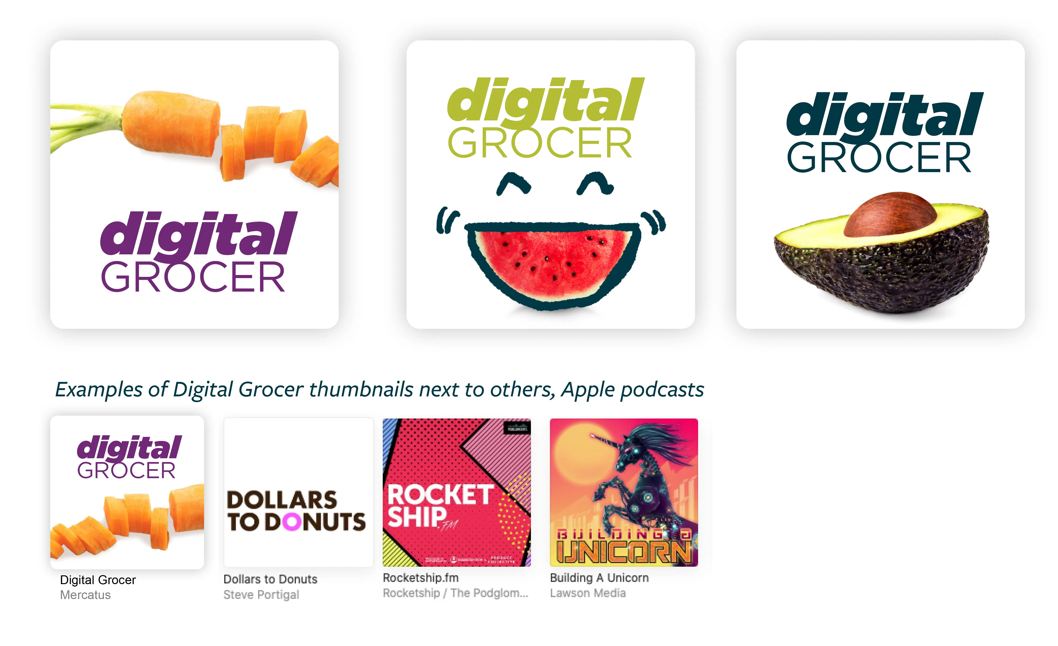
My research focused on exploring effective podcast and radio logos. What types of marks looked good at small scale, and in a square format? Which logos felt cramped or busy? Would including a person in the podcast draw listeners in?

Logo Exploration
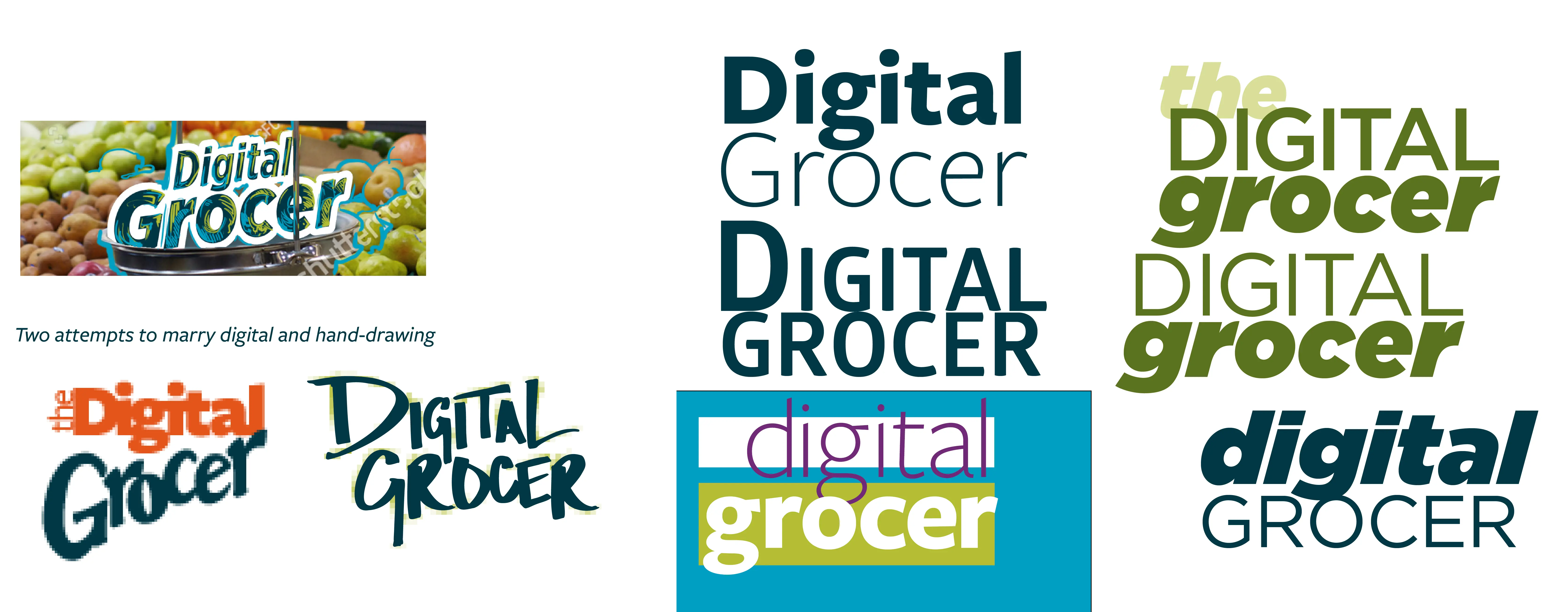
My early sketches combined hand-drawn type and digital. Some of them drew on a text treatment used for a massive, multi-phase brand ad campaign. I was still working in the Mercatus brand palette, but weighted it heavily towards tertiary colors. Digital Grocer content would be cross-posted on the Mercatus website. I wanted the main brand and sub-brand to look similar but different.
Final Logo?
After a few rounds, we landed on a wordmark made from two different weights of Gotham. The stacked and unstacked versions promised design flexibility. The boldness of the font appealed to the senior stakeholder, Sylvain Perrier. I began to design thumbnails in earnest, looking for a photography look and feel that I could start to apply to other assets.

The Color Palette
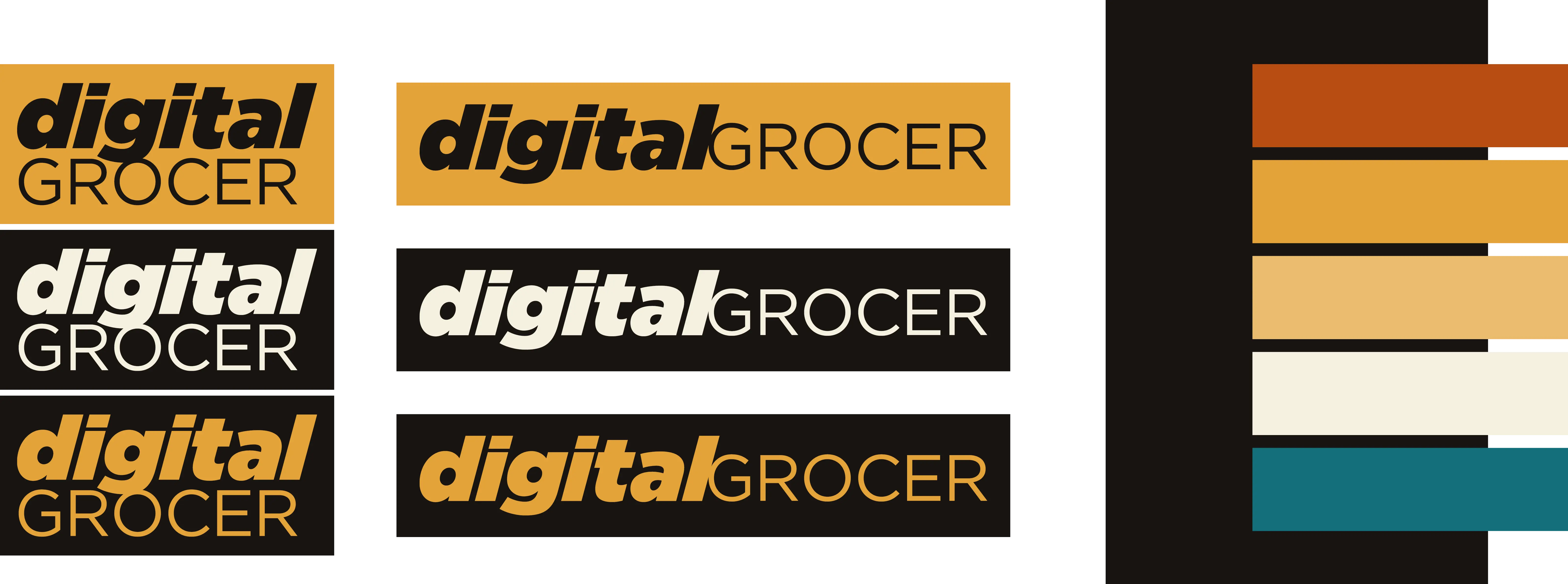
On what was intended to be the last round of logo tweaks before I finalized the visual identity, senior leadership made an abrupt change. They wanted a completely different color palette. Something warmer, bolder, and more Sylvain-esque.
I spent the better part of the day scrambling to find an appealing set, focusing on food and autumnal hues. After an 11th hour meeting with the SVP of Marketing, I had my colors, plus two blues that harmonized with the Mercatus palette.
